bò·no

The brand design exudes elegance and modernity.
CLIENT:
El Conquistador resort
Bò.NO brand design exudes elegance, featuring illustrations crafted with the hatch drawing technique that seamlessly complement the grid-based pattern using the restaurant's name. The logo is a refined, linear type that maintains simplicity, allowing the other brand elements to shine. The modern color palette ties everything together, creating a cohesive and sophisticated visual identity.

logo system

assets & illustrations


branded items


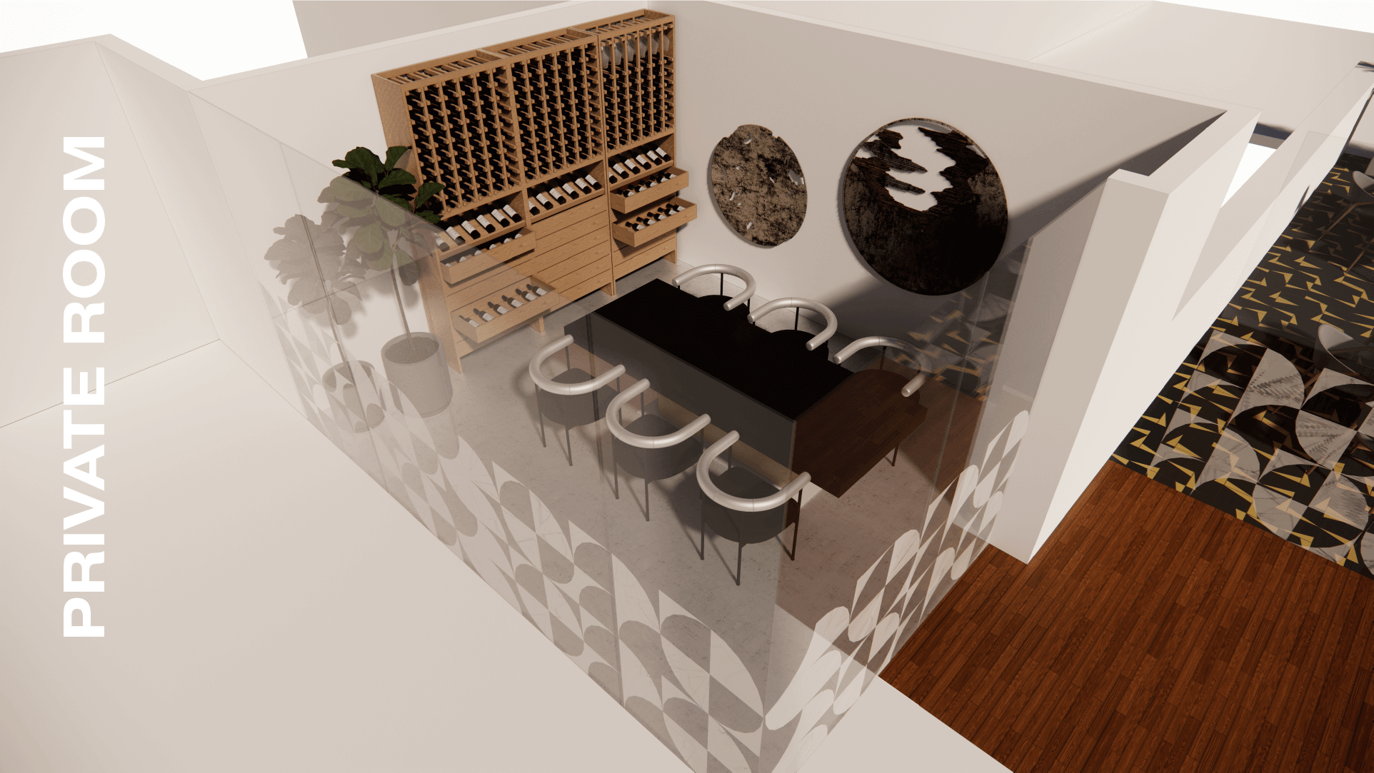
FURNITURE & SPACE DESIGN