HOME FRITE

Home Frite’s brand evolution is all about sharing joy with a vibrant, groovy and bold personality!
Client:
HOME FRITE
IN 2016 we worked on An elegant and homey re-brand for this Brooklyn, NY BASED restaurant, but as it happens with growing businesses, HOME FRITE’s journey took a turn that required the brand to be more impactful. THUS, in 2022 we revamped it to be bold and vibrant to responds to our client’s evolution.

BRAND EVOLUTION
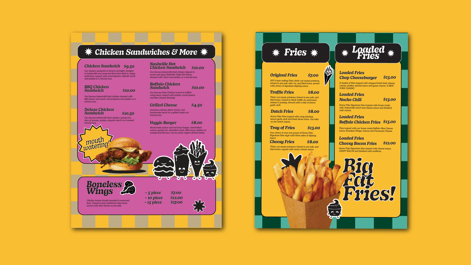
Home Frite is all about shareability, quality, flavor and comfort!
In the 2016 re-brand we modernized the original logotype - which was the most memorable and homestyle element of the original brand - and designed a fries’ cone to create the imagotype that is now the main logo. To create a homey and elegant brand we chose a toned-down color palette that derived gourmet sauces colors.
In 2022, Home Frite wanted to evolve to a joyful and vibrant brand that showcased the growing and customer-loving menu items. We went big and we went bold! Now the brand has a vibrant color palette and patterns, a bolder logotype, and fun and friendly mascots! The brand is all about sharing joy!
Watch the gif above for an interactive brand evolution AND BELOW immerse IN THE GROOViNESS!


website


social media

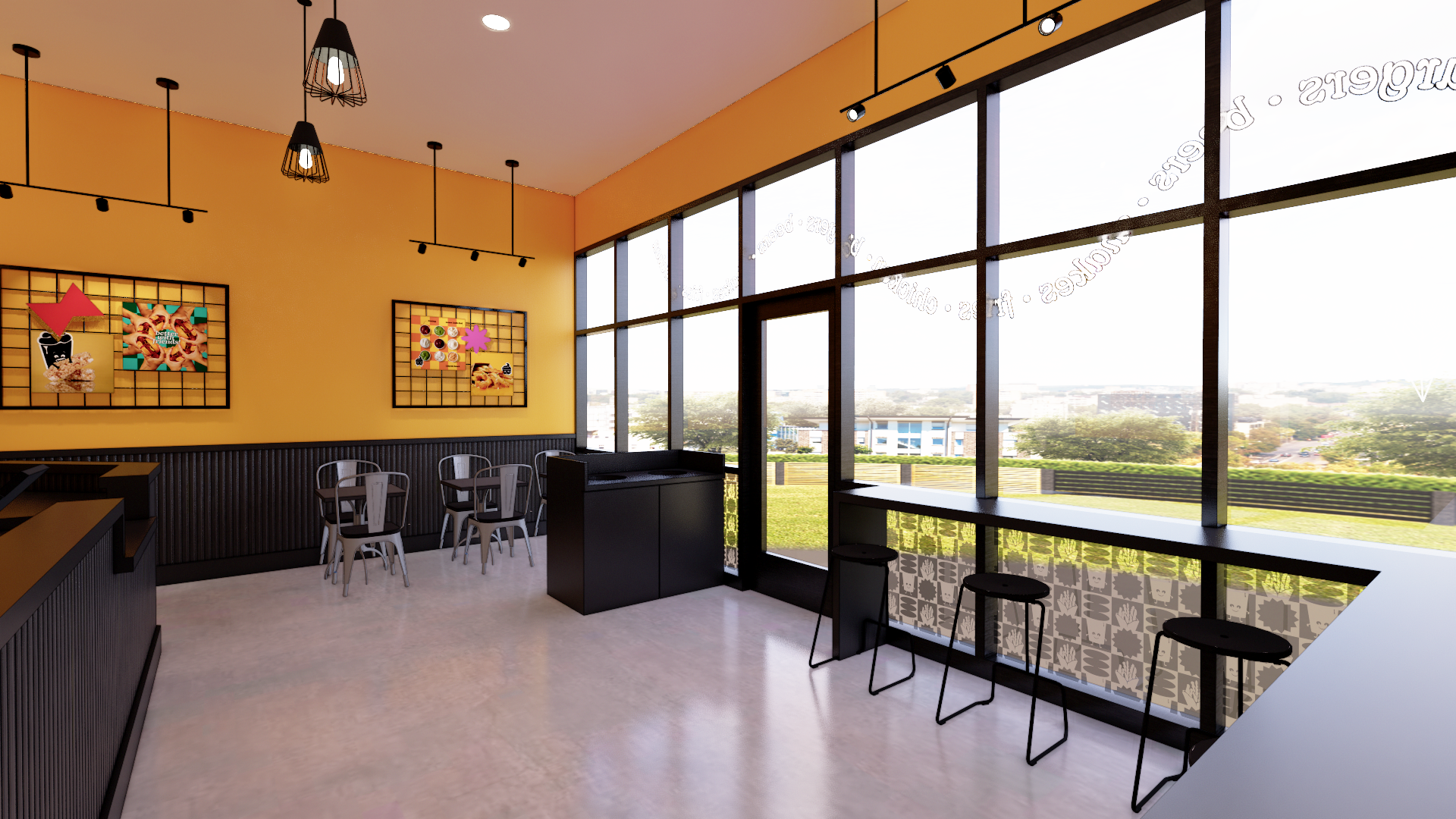
STORE DESIGN